We’ve reached the end of Fall Semester COM 561, and what a journey it’s been! This course has been an incredible learning experience, allowing me to dive into the Adobe software suite and learn the InDesign, Photoshop, Illustrator, Audition, and Premiere programs. At the start of the semester, I had never worked with any of these programs, so each one presented its own significant learning curve. As I’ve looked back on my four projects, it’s been exciting to see how much progress I’ve made.
For our final assignment, we needed to choose one project to further revise. I decided to revisit my audio interview with my friend Jay, where we talked about his first time in Japan. I chose this Adobe Audition project because it was the most challenging one for me to complete. After submitting the final version weeks ago, I knew there were some adjustments I could make to improve the sound levels and enhance the experience for the listener.
I first wanted to improve the volume levels of the interview clips and the background music. I increased those and made adjustments in clips that needed extra tailoring using the volume bar and adding keyframe points to further tailor specific parts that were too loud or soft. I also added some sound effects that went nicely with the story to give the listener a more immersive experience. I cropped these with the razor and cropping tools and even spliced two clips together to make the baseball bat hit and cheering sound like one continuous clip.
The entire editing experience in Adobe Audition really opened my eyes to how long it must take to create professional-level audio, considering the work required for a two-minute interview. I hope to use Adobe Audition for promotional and storytelling audio projects in my future nonprofit communications work, so it’s time well spent. I hope my adjustments enhanced the interview, making it more engaging, easier to listen to, and immersive for my intended audience: first-time travelers to Japan. I could see this interview being featured on a travel website or as a part of a travel podcast episode about visiting Japan for the first time.
Last week, for our final project in COM 561, my peers and I created video stories using Adobe Premiere, Audition, and Illustrator to showcase our mock brands. The assignment is to create three videos of these brands for social media and broadcast. Earlier in the semester, I made a brand called Serenity Park. This park serves as a tranquil, natural retreat for visitors to enjoy. When brainstorming video storytelling ideas for the park, I was inspired by a trend on social media: videos captioned “life without trending audio” featuring stunning natural scenes paired with their natural sounds rather than popular music overlays. This minimalist, immersive approach felt like a perfect fit for Serenity Park. So, I planned to use my phone to film beautiful nature scenes at the parks where I had shot brand photography for a previous assignment. Unfortunately, a bomb cyclone hit western Washington the week I had to film the draft videos, making it impossible to revisit those parks. Thankfully, I had thought ahead and had captured some video footage during my photography shoots. After the storm cleared, I filmed more scenes at a nearby park.
After assessing my footage and audio, I began storyboarding the video. I carefully selected shots that aligned with the natural, serene style of the park. The audio proved difficult in some shots as people would come along the trails, or a propeller plane would fly noisily above the shot. For the scenes with audio issues, I found some clean audio clips online at freesound.org. I decided to start the videos with a reminder notification pop-up graphic. I wanted a slow, steady, relaxing pace for the viewer so the video would induce a peaceful state of mind. For the closing scene, I chose an evening ambiance audio clip with natural cricket sounds to create a closing serene mood as the park’s logo, tagline, and call to action appeared on the screen.
Once the outline, shots, and audio were roughly assembled, I imported the footage, audio, and the Serenity Park logo into Adobe Premiere. Then, I designed the pop-up notification graphic in Illustrator and imported it. I edited together the Facebook video first. I trimmed scenes and audio with Premiere’s razor and cropping tools. I used the text tool and Effects Control panel, adding text overlays and adjusting their scale, position, color, and font. I used Lumetri Color correction tools, brightness, and contrast adjustments to adjust the visuals. Then, I added cross-dissolve transitions to create a smooth, calming flow across all elements—audio, footage, graphics, and text boxes. Next, I made new sequences for the Instagram and broadcast versions within the same project. I copied and pasted the original elements, then trimmed the scene durations to fit each time requirement. Once I finished each video, I used the mark-out tool to ensure each was exactly the length needed, then exported and submitted them.
After submitting my video drafts, I got some really kind and thoughtful feedback from my peers to help me re-evaluate and improve my draft video story designs. They mentioned they liked the overall calming style of the videos, the footage I captured, and the pop-up reminder notification idea at the beginning of the videos. They also had some helpful suggestions to improve the videos, like including the logo at the start of the video, ensuring the mountain scene wasn’t paced too quickly, allowing the nature shots to be the focus a bit more by making the text less prominent, adding more shots to increase the pace a bit, and adding some soft background music or a voiceover help bring the video together and help the scenes resonate with the audience more. I loved the suggestions and enjoyed trying them to see which worked best for the videos. To revise the videos, I first shot some additional footage at a local park, and added the footage and audio to my drafts. I again used the razor, volume, cropping, default transitions, and Effects tools to adjust the footage and color balance. I added the logo after the pop-up scene. Then, I recorded a voiceover, which sounded nice, but it didn’t feel right when I removed the text from the scenes. I wanted to ensure people watching without audio would connect to the message. Also, somehow, my voiceover was distracting from the videos’ slow, peaceful pace, and having both the text and voiceover made it feel too busy and redundant. So, I deleted the voiceover and added the text boxes back in. However, I placed them at the bottom of each video and reduced the background color transparency to reduce their visual weight. Then, I added some soft background music to increase the emotional resonance for the audience. I think this solution works really well!
Overall, the process was challenging yet rewarding, and I’m excited about how the final product captures the essence of Serenity Park.
P.S. I had to upload the Instagram and broadcast videos to Vimeo instead of YouTube because I had reached YouTube’s upload limit.
STORY BOARDS FOR EACH VIDEO:
Facebook Video 1920px x 1080px TRT (Total Run Time) 1:30
:00 – :05
:05 – :09
:09 – :16
Close up view of forest stream
Black background with logo
Panorama view of mountains
Text box and reminder notification graphic: “REMINDER: You have the power to protect your peace.”
Text box: VISIT [logo] WHERE YOU CAN…
Text box: SOAK IN THE PARORAMIC VIEWS
Audio: stream and forest sounds
Audio: stream and forest sounds
Audio: wind through the mountains and trees
:16 – :25
:25 – :36
:36 – :46
Rocky beach to water horizon
Waterfall from bank that pans to water below
Bufflehead ducks diving in a lake
Text box: SMELL THE SALT AIR
Text box: FEEL THE MIST OF A WATERFALL
Text box: DIVE INTO SMALL MOMENTS OF JOY
Audio: lapping water and gulls
Audio: waterfall sounds
Audio: birds and trees rustling
:46 – :54
:54 — 1:07
1:07 – 1:21
Close up view of birds along a rocky hiking trail
Close up view of mushrooms then panning to sun through forest
Cormorants on the water with sun reflection pan to mountain in background
Text box: NOTICE OTHERS ALONG YOUR PATH
Text box: WITNESS THE SECRETS OF THE FOREST
Text box: MARVEL AT TIMELESS HORIZONS
Audio: wind through the mountains and trees
Audio: forest sounds
Audio: Gentle water sounds with gulls
1:21 – 1:30
Black matte background
Text box: Find your peace Serenity Park logo graphic Text box: WHERE PEACE TAKES ROOT
Audio: Evening ambiance with insects softly buzzing
Instagram Video 1080px x 1920px TRT :45
:00 – :05
05: – :08
:08 – :16
Close up view of forest stream
Black background with logo
Panorama view of mountains
Text box and reminder notification graphic: “REMINDER: You have the power to protect your peace.”
Text box: VISIT [logo] WHERE YOU CAN…
Text box: SOAK IN THE PARORAMIC VIEWS
Audio: stream and forest sounds
Audio: stream and forest sounds
Audio: wind through the mountains and trees
:16 – :24
:24 – :37
:37 – :45
Waterfall from bank
Cormorants on the water with sun reflection pan to mountain in background
Black matte background
Text box: FEEL THE MIST OF A WATERFALL
Text box: MARVEL AT TIMELESS HORIZONS
Text box: Find your peace Serenity Park logo graphic Text box: WHERE PEACE TAKES ROOT Text box: Visit serenitypark.com or find us on social @serenitypark
Audio: waterfall sounds
Audio: gentle water sounds with gulls
Audio: Evening ambiance with insects softly buzzing
Broadcast Video 1920px x 1080px TRT :30
:00 – :03
03: – :06
:06 – :11
Close up view of forest stream
Black background with logo
Panorama view of mountains
Text box and reminder notification graphic: “REMINDER: You have the power to protect your peace.”
Text box: VISIT [logo] WHERE YOU CAN…
Text box: SOAK IN THE PARORAMIC VIEWS
Audio: stream and forest sounds
Audio: stream and forest sounds
Audio: wind through the mountains and trees
:11 – :18
:18 – :25
:25 – :30
Waterfall from bank
Cormorants on the water with sun reflection pan to mountain in background
Black matte background
Text box: FEEL THE MIST OF A WATERFALL
Text box: MARVEL AT TIMELESS HORIZONS
Text box: Find your peace Serenity Park logo graphic Text box: WHERE PEACE TAKES ROOT Text box: Visit serenitypark.com or find us on social @serenitypark
Audio: waterfall sounds
Audio: gentle water sounds with gulls
Audio: Evening ambiance with insects softly buzzing
For our final project in COM 561, we’re creating video stories in Adobe Premiere for the brands we’ve made. I’m continuing my work using the brand I created called Serenity Park. If you’ve been following along, you’ll know that Serenity Park is a peaceful, natural escape for people to enjoy, with various activities and landscapes. In thinking about how to approach video stories for the park, I remembered some videos I recently saw on social media with the caption “life without trending audio,” where beautiful natural scenes accompany their native sounds without music overlayed. I enjoy this simple yet effective promotion, which works well for places like Serenity Park. So, I decided to film beautiful shots of panoramic views, waterfalls, local wildlife, etc., and use the sounds native to the video itself or, if there were any audio issues, to find some audio close to the natural sounds captured while filming. This week was definitely not a good week for filming, considering the bomb cyclone that came through western Washington. So, I couldn’t return to the parks where I had initially shot the photography for Serenity Park. Thankfully, I thought ahead when I was shooting the photography and had also captured some videos. I also I filmed some footage at a park close by after the storm had passed and the sun came out briefly.
After getting the footage, I worked on my storyboarding for how the video would flow and what text I would use across the scenes. Thinking through the beginning, pacing, and ending, I thought it would be fun to mock up a little “reminder” notification message at the start of the video so the video story would act as a little break from the business of life, whether watching on your phone or TV. After selecting which shots would best suit the video’s natural, peaceful style, I listened to the audio associated with the shots and deleted the audio that picked up bystanders, had irregular noises coming through, or just didn’t work well. For these shots, I searched on freesound.org for audio that would match the scenes. I found some lovely audio pieces for the few scenes that needed them. While searching through the audio clips, I finished the video with an evening ambiance audio clip that might lull the viewer into a peaceful state as the logo and tagline came on the screen, reinforcing the brand’s message. I think it made for a nice effect at the end.
After roughly putting the shots and audio together, I imported the PNG file of the Serenity Park logo I made in Adobe Illustrator a few weeks back. To do this, I crafted a pop-up dialogue box graphic in Adobe Illustrator and imported the PNG file to Adobe Premiere. I also created a black matte within the sequence for the logo and tagline to appear on at the end of the video. Once I had all my elements imported and arranged, I watched the clips several times over, trimming the scenes and audio with the razor and cropping tool where needed. I used the text tool and the Effects Control panel to add text and then adjust the text’s scale, position, color, and font. I adjusted the volume using the volume bar and the color of clips using the Lumetri Color correction tools and other tools like brightness and contrast. I used cross-dissolve transitions to keep a peaceful, smooth flow to the video, applying these to the music, footage, graphics, and text.
After finalizing my Facebook video, I used the mark out tool to ensure it was precisely 1:30 in length before exporting it. I then watched the video on my laptop’s video player to confirm it came out as expected. Once satisfied, I uploaded it to my YouTube channel. Then, I set up new sequences within the same project to create versions for Instagram and broadcast. I copied and pasted the video, audio, text, and graphics from the Facebook sequence into these new sequences. Next, I cut scenes to fit the required durations.
During the editing process, I noticed that cropping and deleting scenes caused some transitions to be erased, so I added those transitions back in. I also adjusted the scale and position of the footage, text, and graphics for the Instagram video ratio. Once I was happy with the Instagram and broadcast videos, I exported them and followed the same review process. However, I noticed that YouTube consistently added one extra second to each video, even though I had triple-checked my mark out points. Despite re-watching and re-uploading the videos, this issue persisted. If anyone knows why this happens, please let me know.
Overall, I’m happy with these drafts and excited to hear feedback from my peers. I’m also looking forward to seeing the creative videos they’ve produced! 🙂
STORY BOARDS FOR EACH VIDEO:
Facebook Video 1920px x 1080px TRT (Total Run Time) 1:30
:00 – :10
:10 – :15
:15 – :35
Close up view of forest stream and trees
Panning through stream
Panorama view of mountains
Text box and reminder notification graphic: “REMINDER: You have the power to protect your peace.”
Text box: ESCAPE TO A PLACE WHERE YOU CAN…
Text box: SOAK IN THE PARORAMIC VIEWS
Audio: stream and forest sounds
Audio: stream and forest sounds
Audio: wind through the mountains and trees
:35 – :50
:50 – 1:00
1:00 – 1:06
Waterfall from bank that pans to water below
Bufflehead ducks diving in a lake
Pacific coastline with waves and eroded cliffs
Text box: FEEL THE MIST OF A WATERFALL
Text box: DIVE INTO SMALL MOMENTS OF JOY
Text box: MARVEL AT THE TIDES TIMELESS ARTISTRY
Audio: waterfall sounds
Audio: birds and trees rustling
Audio: waves and wind
1:06 – 1:23
1:23 – 1:30
Close up view of birds along a rocky hiking trail
Black matte background
Text box: TAKE TIME TO NOTICE OTHERS ALONG YOUR PATH
Text box: Find your peace Serenity Park logo graphic Text box: WHERE PEACE TAKES ROOT
Audio: wind through the mountains and trees
Audio: Evening ambience with insects softly buzzing
Instagram Video 1080px x 1920px TRT :45
:00 – :03
03: – :08
:08 – :16
Close up view of forest stream and trees
Panning through stream
Panorama view of mountains
Text box and reminder notification graphic: “REMINDER: You have the power to protect your peace.”
Text box: ESCAPE TO A PLACE WHERE YOU CAN…
Text box: SOAK IN THE PARORAMIC VIEWS
Audio: stream and forest sounds
Audio: stream and forest sounds
Audio: wind through the mountains and trees
:16 – :24
:24 – :32
:32 – :41
Waterfall from bank that pans to water below
Bufflehead ducks diving in a lake
Close up view of birds along a rocky hiking trail
Text box: FEEL THE MIST OF A WATERFALL
Text box: DIVE INTO SMALL MOMENTS OF JOY
Text box: TAKE TIME TO NOTICE OTHERS ALONG YOUR PATH
Audio: waterfall sounds
Audio: birds and trees rustling
Audio: wind through the mountains and trees
:41 – :45
Black matte background
Text box: Find your peace Serenity Park logo graphic Text box: WHERE PEACE TAKES ROOT
Audio: Evening ambience with insects softly buzzing
Broadcast Video 1920px x 1080px TRT :30
:00 – :03
03: – :08
:08 – :15
Close up view of forest stream and trees
Panning through stream
Panorama view of mountains
Text box and reminder notification graphic: “REMINDER: You have the power to protect your peace.”
Text box: ESCAPE TO A PLACE WHERE YOU CAN…
Text box: SOAK IN THE PARORAMIC VIEWS
Audio: stream and forest sounds
Audio: stream and forest sounds
Audio: wind through the mountains and trees
:15 – :20
:20 – :27
:27 – :30
Waterfall from bank that pans to water below
Close up view of birds along a rocky hiking trail
Black matte background
Text box: FEEL THE MIST OF A WATERFALL
Text box: TAKE TIME TO NOTICE OTHERS ALONG YOUR PATH
Text box: Find your peace Serenity Park logo graphic Text box: WHERE PEACE TAKES ROOT
Audio: waterfall sounds
Audio: wind through the mountains and trees
Audio: Evening ambience with insects softly buzzing
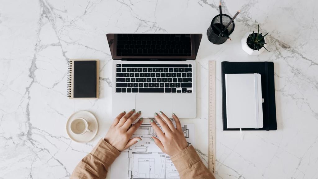
For this assignment in COM561, we’re tasked with revising our two-minute interviews to create a polished, high-quality result. The entire process has been incredibly valuable for familiarizing myself with Adobe Audition’s editing tools. I was venturing into uncharted territory with this software, so it was a significant learning experience. As someone who enjoys a good audio experience—whether it’s audiobooks, podcasts, or ASMR—it was exciting to get some “behind-the-scenes” insight into audio editing.
My first step was selecting an interview subject with an interesting story to share. I asked my friend Jay, who is currently visiting Japan for the first time, if he’d be willing to talk about his experiences. He agreed, and we initially tried a phone call but switched to Zoom for better audio quality. I prepared a short list of questions to prompt Jay to reflect on how Japan has influenced his cultural perspective. Our conversation lasted about 30 minutes, which provided ample content to distill into a concise two-minute clip. Jay’s responses included some natural pauses and “thinking aloud” moments, which made for several hours of editing but offered a great lesson in how much effort goes into crafting clean, cohesive audio.
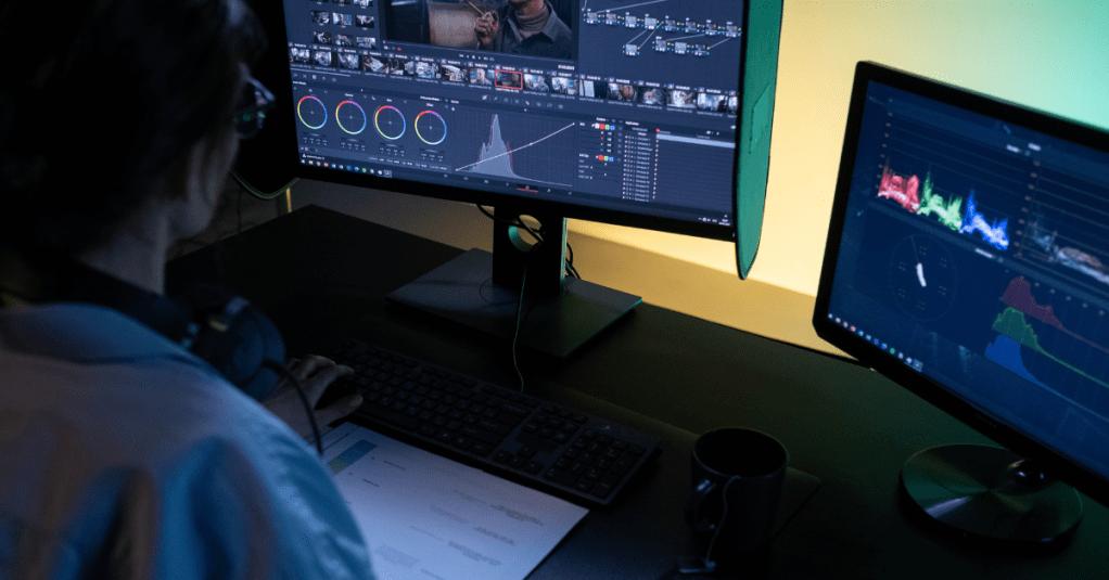
I found the editing process to be both time-consuming and satisfying. After uploading the Zoom audio to Adobe Audition, I listened through, marking sections of interest and making initial cuts. The razor and cropping tools quickly became my best friends as I removed filler words, pauses, and segments that didn’t contribute to the core story. I also relied on zooming in and out to make precise edits, allowing me to seamlessly join segments while trimming away extraneous content. For background music, I explored Creative Commons and found a subtle piano melody that complemented our conversation well. Using the fade tool, I gradually lowered the music as Jay answered his final question, creating a natural, polished ending. Finally, I uploaded the interview to SoundCloud and submitted it.
After submitting, I received very encouraging and helpful feedback from my peers. They noted that the interview had a professional quality, with clean audio and engaging content, and they appreciated the soft background music, saying it enhanced the flow. I also received helpful suggestions for improvement, including adding pauses between certain clips to allow the audience time to process, and balancing the audio levels for consistency throughout. One peer specifically mentioned adding a pause at the 1:42 mark, where Jay mentions “cheering for the Dodgers.” I addressed this by slightly expanding the clip, and to improve flow, I decided to cut the phrase “for the Dodgers” altogether, which resolved the issue without causing confusion. During this second editing round, I figured out that you can select multiple clips by clicking and dragging across the clips, just like you can select multiple elements in Adobe InDesign. This made moving the clips around so much easier!
While one peer suggested increasing the music volume, I decided to keep it at its current level since I wanted the music to act as a subtle background element, supporting but not overshadowing the voices. Reviewing my peers’ work was also insightful; one classmate’s interview included a “preview” segment before the formal introduction, which reminded me of how YouTubers do this to pique interest in the full content at the beginning of their videos. I didn’t use that technique here, but I’d definitely like to try it out for future projects. To complete my second round of editing, I carefully listened through the audio, adjusting the volume by adding control points to fine-tune the levels and try to create a consistent, balanced sound throughout.
Overall, this assignment has been a rewarding and satisfying deep dive into audio editing, and the feedback I received has been so helpful for refining my work. Thank you to my peers for your feedback, and to you, dear reader, for listening!
For this assignment in COM561, we’re conducting a quick interview and designing the sound to create a high-quality audio result. I’ve never mixed or designed any sound outside of very simple designs on Canva, so I was nervous but excited to tackle this one! I love a good audio experience, from audiobooks to podcasts, I love a good auditory performance, so I was excited to see how that process works behind the scenes.
First I needed to select a subject, so I choose to interview my friend Jay who is in Japan for the first time. I thought this would be a neat topic for the short interview where we could get a little glimpse into what it’s like there. Before the interview, I prepared a short list of questions to get a general feel of what it’s been like for Jay in Japan and what he has found most impactful so far during his visit. Since he’s currently there in Japan, we tried doing a phone interview, but ended up doing the interview on Zoom because it captured the audio much more clearly and cleanly. We spoke for around 30 minutes and Jay took quite a lot of pauses and roundabouts, so I ended up having several hours of editing, but it was a great lesson on how long it takes to clean up audio.
To begin editing, I uploaded the audio portion of the Zoom interview into Adobe Audition. Trimming the copious amounts of ums, uhs, pauses, and filler conversation out of the interview was very satisfying, but seriously labor intensive. The razor tool was my dearest companion for this project. I also heavily utilized the zoom in and zoom out tools to really hone in on the segments of audio I was clipping. This was especially useful for when I need to stitch two separate phrases together. I don’t think I managed to get them to be seamless, but I tried. I also tried to get the volume right – adding those little points on the volume line and adjusting as needed. I know I need to refine the volume consistency a bit more, but this too was a laborious but satisfying part of the editing.
Once I had razored, selected, and deleted all the bits that didn’t make the cut or added lag to the interview, and I had adjusted the volume to where I thought it sounded okay, I needed to add some music for effects. I couldn’t think of sound effects that could be cool to add other than music, but if you have any suggestions, please let me know, because that could lend some more fun or interest to the interview. I searched through the Creative Commons resources and found a nice little piano background melody that, once I turned the volume down, sounded nice alongside mine and Jay’s speaking. I made sure the music didn’t abruptly end by using the fading tool to gradually fade it out while Jay was answering the last question.
Once the editing was done, I selected the part where I wanted the audio session to end and held down O to make sure it didn’t go past that point, like our previous instructional videos advised, then exported it, and uploaded it to SoundCloud. I wasn’t sure how to attribute the music I selected so I popped the attribute into the caption on the upload. All in all, the interview, while only two minutes and nine seconds, really gave me a nice insight into sound editing. It was a lot more work in editing than I expected, but I was glad I had more audio to choose from than less. I think it turned out well for the first draft, but I’m looking forward to my peers’ feedback and polishing it up! I hope you enjoy this little slice of what it’s like to be in Japan for the first time.
I really enjoy the feedback process of design, and I got some nice and thoughtful feedback from my peers on my Serenity Park campaign! I truly do love to photograph and talk about nature, so this project was very satisfying to create. I hoped the brand and tranquility theme would resonate well and across the pieces of collateral and, based on the feedback, it seems to have done so.
The first step of creating the marketing campaign was to define the concept and purpose of Serenity Park. I wanted to create a brand that conveyed a peaceful, natural escape for people to enjoy with various activities and landscapes. I created the name, logo, and tagline to encourage this concept. The logo needed to visually represent peace and nature, so using Adobe Illustrator, I designed the logo to include a tree and moon, both symbols of calm and natural beauty. I used the line and curvature tools to create a simple yet effective depiction of a pine tree. I made the moon with the ellipse tool and brought the two together. I made a black and white version of the logo with transparent backgrounds to accommodate the spacing and contrast needs of the pieces.
To bring the concept to life visually, I needed photography that evoked awe, inspiration, curiosity, and ultimately, desire for the park. I shot in Olympic National Park, Tolmie State Park, and Millersylvania State Park. Once I had my photographs I selected the best ones for variety, consistency, and clarity. Choosing the main image was the hardest part of selecting an image because it carries the entire campaign forward with the other images supporting.
For the typography, I wanted it to match the park’s theme of serenity while remaining clear and impactful. I established a hierarchy of text using the Futura font family, applying different styles (condensed medium for the logo, medium italic for the tagline, and bold for headings) to create visual distinction.
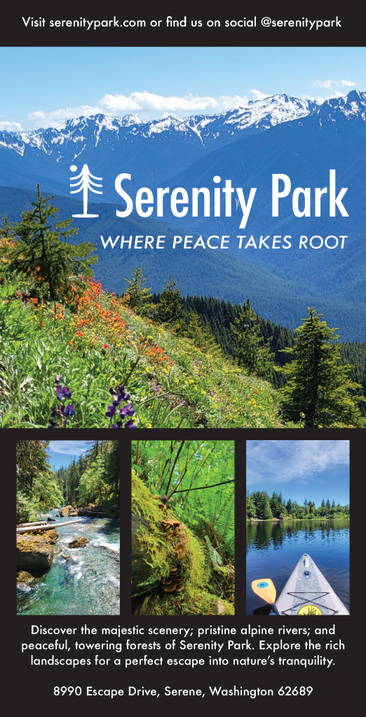
In designed the poster, brochure, print ad, and social media posts, I paid careful attention to scaling images and maintaining a clean layout that would guide the audience’s eyes toward the focal points—logo, tagline, and visuals—while balancing aesthetic and functional aspects. For the print ad, readability was prioritized, especially for older audiences who gravitate towards print more than younger folks. I used a clean layout with limited text to ensure the focus was on the descriptive blurb, call to action, and hashtag. For the Facebook and Instagram ads, I focused on the visual impact of the main photograph to capture attention, with minimal copy to drive engagement and clicking through to learn more. I designed the billboard to emphasize the call to action, using the bold style of the Futura font to ensure legibility for passing drivers. I designed each piece with its audience and context in mind, using large, readable fonts for print or using a striking visual focus for the social media pieces.
The first piece of feedback I received was for the poster: to add more descriptive text and try something other than the black background, perhaps making the background image opaque to feature the text box. To address this, I added the location address to the bottom of the poster. While there, I center aligned the descriptive blurb and found this looked better to my eye. Another piece of feedback I received was to diversify the photography a bit more. I liked this idea, so I also swapped out a picture of the trees on the poster with the photograph of the paddle board to mix up the different areas of the park being featured. I do think it makes the collateral a bit more dynamic to include varied photography. However, I did try a few different background styles, including making the background photograph gradually opaque to feature the text box, but ultimately, I think the black works best for clarity and contrast, which is important for a quickly read poster.
I was also advised to diversify the text weights and sizes a bit more. Visual hierarchy and variety of typography is so important for a marketing campaign to be effective. The only piece that I think that could benefit from this would be the on the print ad. So, I played around with the descriptive blurb and call to action text to try to get more differentiation and visual hierarchy. I landed on changing the blurb and call to action from Futura, Medium Italic to Futura Medium and then changed the descriptive blurb to Futura Bold. I think this achieved the effect.
Throughout the design process, from draft to final, I tried my best to emphasize consistency in messaging, a strong visual connection to nature, as well as visual impact, flow, and appropriate hierarchy throughout the pieces. I hope that, like the park, the marketing campaign gives one a sense of the simplicity of nature and the desire to take action towards that peace. It was really cool to be able to model my park from the gorgeous parks I visited to shoot the photography. I feel very fortunate to live in this visually stunning and peaceful region of the world that inspired Serenity Park.
I’ve been photographing nature for years, and so when I saw this assignment called for creating a fictitious organization or product and its marketing campaign, I knew I wanted to do something focused on nature and its ability to transport people to a different world. I decided to create a park, called Serenity Park, where people could get lost in a place that felt like an oasis of calm, beautiful energy and scenery. I took a couple of days to photograph areas in Olympic National Park and Tolmie State Park with my cell phone to capture some wide-angle, stunning views as well as some up-close photographs of the trails’ diverse flora. I also got a shot of me on a paddleboard at Millersvania State Park. It was a fun week! I edited the photographs in Adobe Photoshop to color-correct them using the numerical correction technique we learned and played around with the contrasts and saturations. Once the photos were edited, I was ready to create the logo. I wanted the logo to combine peacefulness and nature, so I searched online for examples and decided to make a logo with a tree and moon. I’ve never deisnged a logo before, so I was excited to test out the features in Adobe Illustrator. First, I used the ellipse tool to make a circle moon and the base and trunk of the tree. Then, I used the line tool to create the tree branches and used the curvature tool to curve them to depict a pine tree shape. I grouped the tree and moon together and added the title Serenity Park, aligned to the bottom of the base of the tree and moon graphic. I created a black-and-white version in case I needed to switch between the two for the various pieces needed for the assignment.
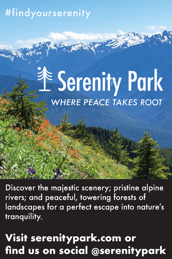
I created the tagline “Where peace takes root” and added it underneath the Serenity Park logo, leaving enough space between to ensure the logo kept its visual integrity and prominence. I grouped the logo and tagline together, then copied and “pasted in place” that object combo throughout the pieces of collateral to keep the tagline and logo spaced consistently. I also thought it would be a nice touch to come up with a hashtag to use across the pieces and in the social media caption. Adding this at the top of the pieces created some vertical visual balance, and it serves as a nice takeaway should an audience member only quickly scan the piece.
For the typography, I wanted to convey simple but bold lines of text to match the theme of “serenity.” So, I chose Future font and created a visual hierarchy by formatting the different types of copy with differing styles. I formatted the logo in the condensed medium style, the tagline in medium italic, the body in medium, the body headings in condensed extra bold, and the body subheadings in bold. I kept the text colors in black and white throughout the pieces, going between them and adjusting them to contrast well with the background. I ensured the #findyourserenity didn’t overtake the logo or tagline through spacing and scale.
For the poster, I included a main background photograph that is featured prominently throughout the collateral as well as three smaller photographs that conveyed more particular parts of the park for visual interest. Scaling these photographs down enabled me to include them without detracting from the logo and tagline’s focal prominence. I also added black rectangles to house text boxes above and below for visual balance and to ensure the text was vivid and easy to read. For the brochure, I kept the outside pages clean and succinctly informational so that the inside text didn’t feel overwhelming and the main photograph could create a wide-view impact once opened. I also added the three smaller photographs from the poster, plus another, to give more insight into the park along with the informative copy.
For the print ad, I ensured the text was large enough to read, even for older folks, and, outside of the logo and tagline, I kept the copy to the descriptive blurb, call to action, and hashtag. I kept the Facebook and Instagram ads focused on the main photograph for a visual wow factor and because audiences can click through for more information online. I added the hashtag to encourage viewers to take action and hopefully be intrigued by the park’s online community. I created the billboard artwork similarly, except I also made sure the call to action was particularly bolded on the billboard, using the bold style of the Future font so drivers could quickly visually absorb that line to take action.
This project was so much fun – from shooting the photographs to mocking up a logo – I had a really great time crafting this marketing campaign for my dreamy oasis at Serenity Park! I feel much more comfortable in Adobe Illustrator, Indesign, and Photoshop now, and I can’t wait to continue improving my skills!
This week, we got to revise the print and digital pieces from our last posts based on peer feedback and further thoughts. First, let’s recap how I designed the pieces initially. I began the poster design by adding guidelines along the vertical and horizontal axes to apply the rule of thirds. I selected the images I thought had the most impact to feature at the top and bottom of the poster. I selected three other images that gave more insight and detail of the interior of the space to feature in the middle of the poster. I arranged the images this way to create balance and guide the viewer’s eye through the information. For both the poster and social media ads, I used Helvetica Neue, adjusting its weight and size to establish a clear hierarchy from the most important details to the least. I also ensured the font’s horizontal scale fit my desired spacing, creating a clean, bold look for the headings and easy-to-read styles for body text. I experimented extensively with font horizontal scale, font leading point, paragraph spacing before and after, as well as the alignment of the text boxes with the images until the layout felt visually appealing and impactful, while maintaining a focus on alignment, hierarchy, and limiting negative space.
For the social media ads and print invite, I limited the design to one main image to ensure the important information stood out in the smaller spaces without complicating the main visuals of the design. For the Facebook ad, I included the event details, as I’ve found that Facebook’s older demographic prefers more information, opposed to Instagram users who tend to click through or follow links for additional details.
I got some very nice and helpful feedback on my designs! Some feedback said my designs demonstrated a strong use of visual hierarchy and consistency, making it easy for viewers to navigate. It seems my font choices were effective, allowing variation between elements like bold and italics, particularly on the text-heavy poster. The bold white text on my Instagram post made the design pop and it was suggested to apply a similar technique to the poster, however, I have not done that as I would need to drastically re-scale and rearrange the posters elements to accommodate this feedback.
There were other areas for improvement noted in my feedback: creating more white space between the main photo and text, addressing the cramped feel, and adjusting the scale of the text to avoid overpowering the image on Facebook ad. There was also a suggestion to experiment with more varied imagery and design elements between the social media posts. I tried a few versions of the Facebook post with other images and decided to swap out the main image I first used for the other main image from the poster. Both images holistically show the arts center from an external view, so I find them more appropriate for overarching visuals than the images featured internal glimpses of the arts center. I didn’t want to add any more elements to the Facebook or Instagram ads to keep the attention of the scrolling audiences.
In adjusting my designs using the feedback, I started with the poster. I created more white space between the main photo and the title. While doing this, I realized the event details, which repeats the opening title of the poster, was situated too closely to the event title, so I swapped the immediate elements from above and below the central three images, which put the event details and quote further down the page. This prompted extensive scaling and font style tweaking within the event details and quote to create even more visual symmetry and alignment. Another feedback point I incorporated was to reduce the text size of the Facebook ad, so the picture doesn’t get overwhelmed. As I was doing this, I also noticed how the print invitation could use a little more space between the picture and text for visual ease and so I moved those text boxes to add in the space. I figured out how to hide the frame edges in InDesign to be able to visualize how the elements in the pieces interacted more clearly. This was a game changer for bringing the pieces to their final result!
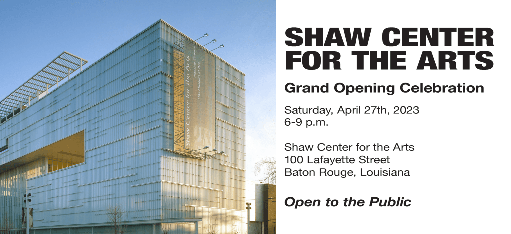
Overall, I think the poster, print invitation, and Facebook ad look much more balanced now and easier to read. I found the InDesign options of showing and hiding the frame edges and guides to be really helpful in making sure the overall designs were spaced and balanced well. Please see the final pieces below. I’m excited to use what I’ve learned moving forward as I improve my InDesign skills!
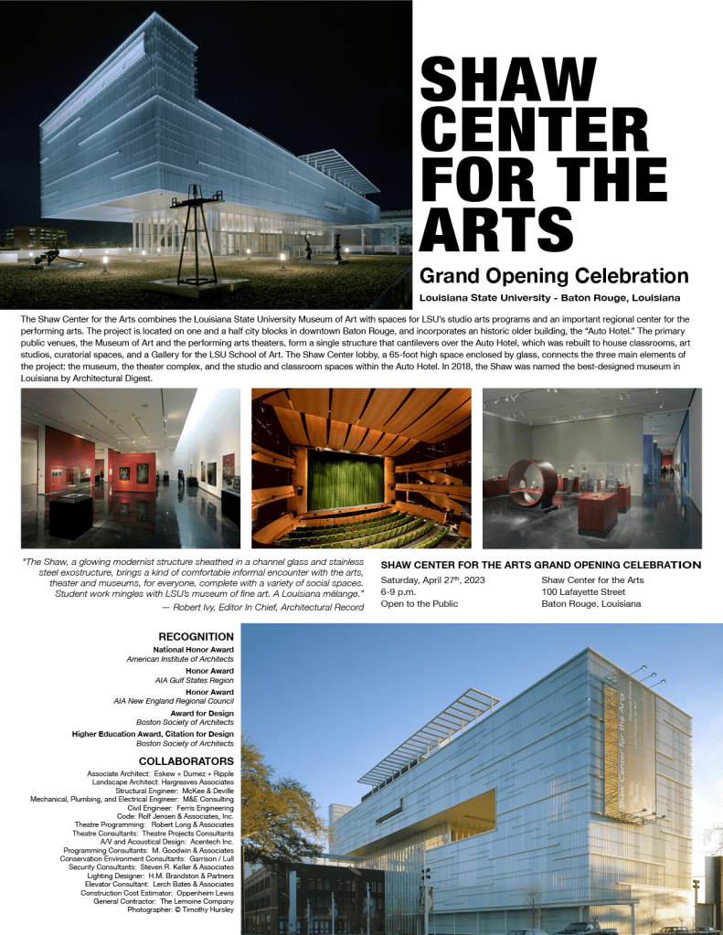
This was my first attempt at print and digital materials in Adobe InDesign, so I was excited to dive in and see what capabilities we’d explore this week! I quickly began to wish we were working in Canva when I saw we needed to adjust the poster information down to social media ad sizes because I love Canva’s magical “resize feature” that does most of this work for you, but I’m glad to be able to do the work in InDesign as well as it offers more technical design capabilities. This week’s assignment was to make a poster, postcard, and social media cards for the Shaw Center for the Arts Grand Opening Celebration. For the poster assignment, I needed to include at least five images from a pre-selected gallery and all the text provided. For the invitation and social media ads, I needed to condense the art and text from the poster down to its essential but still visually appealing forms. Each piece needed to be designed with a simple, strong visual hierarchy and using the strategies of alignment, hierarchy, and negative space.
I began with the poster, dropping in some guidelines along the vertical and horizontal axis to utilize the rule of thirds. Then I decided which pictures I would use and arranged them on either side of the poster and directly in the middle to give balance and visual direction that supported the information presented alongside the pictures. Throughout the poster and social media ads, I used the sans serif font Helvetica Nue with descending levels of weight and point, from most important information to least. I also ensured the font horizontal scale fit my desired spacing for a clean, bold read on the headings. I played around a ton with the font kerning, line weights, and positioning of the text boxes with the pictures until I found them visually appealing and impactful, while also following the strategies of alignment, hierarchy, and negative space. It is important to note that I’ve given special attention to the “open to the public” text because I’ve personally found this key to advertising community events that may feel exclusive. I made sure there was visual hierarchy throughout the poster by enlarging the pictures I believed most impactful and adding in smaller pictures to give a burst of detail. For the social media ads and print invite, I only used the main picture I selected so as to keep it visually stunning, without too many visual grabs from the important information in the more limited spaces.
Between the Facebook and Instagram ads, I left the event details on the Facebook ad because I have personally found Facebook users tend to trend older and like to be presented with more information upfront, whereas Instagram users tend to be more savvy with clicking through to learn more or go to a link in the bio. I found InDesign to be less intuitive than other designs programs I’ve used. However, I really hope to sharpen my skills and add more InDesign shortcuts to my holster so that I can design with more “flow” and efficiency, but I’m happy with the progress thus far.
Hello and welcome to Sarah’s Magic, a little corner of the web where I’ll feature the multimedia products I create for my course, COM561 Professional Multimedia Content Creation. First, let’s get acquainted; I’m Sarah Bunch. I grew up in rural Georgia and Alabama, surrounded by my large, working-class family. There, I learned the value of hard work, community, and service to others. This inspired me to spend most of my career in the nonprofit sector, helping organizations achieve their fundraising budgets and managing their marketing, communications, and public relations efforts.
Like many others, when COVID-19 struck, I experienced a profound shift in my perspective on humanity. I was working for Habitat for Humanity, addressing the issue of affordable housing, but I began to explore much wider humanitarian topics and at the same time, my husband and I began exploring the skies with a telescope. Combined, these led me to read about the “Overview Effect”.
So, what is the Overview Effect? The Overview Effect is a cognitive and emotional shift in awareness experienced by astronauts when they see the Earth from space. This perspective often leads to a profound realization of the planet’s fragility, the interconnectedness of all life, and the insignificance of national borders and conflicts. The term was coined by space philosopher and author Frank White in his 1987 book, The Overview Effect: Space Exploration and Human Evolution.
I believe a major silver lining of COVID-19 was that it gave us all a more global perspective and hopefully stimulated more empathy throughout the world. I’m convinced that space exploration and visitation can achieve the same, and potentially even more, in transforming our understanding of humanity and our small, fragile place among the vastness of the cosmos. I’m excited to explore this topic more throughout the course and hope to perhaps one day work in a nonprofit that provides space visitation for the common man. That’s why throughout the course I’ll create content that explores how the Overview Effect can transform our human perspective.